
The Evolution of Responsive Design: Why Your Website Needs to Adapt
By Adedayo Oyetoke, Published on: January 13th 2025 4 min, 607 word Views: 297
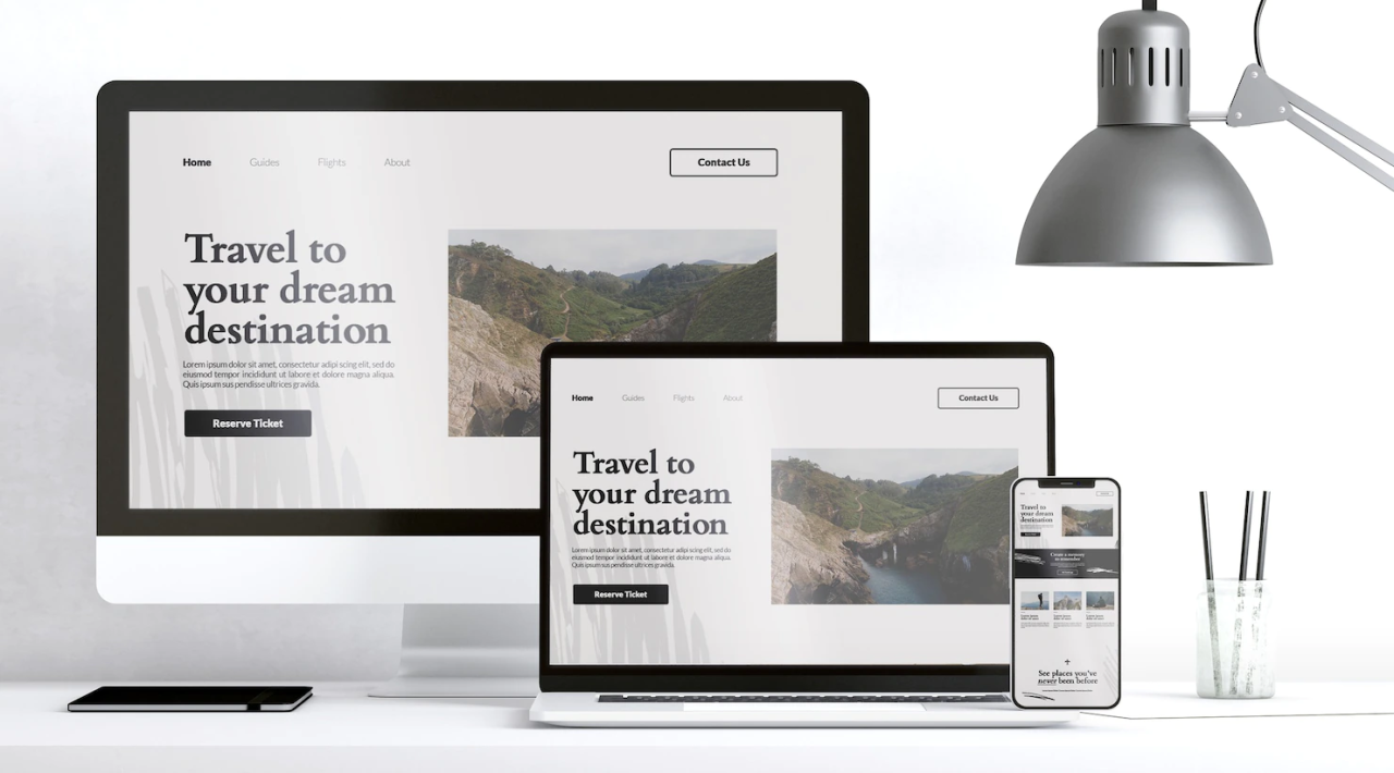
In the digital age, where the internet is accessed through a myriad of devices, from smartphones to large desktop monitors, ensuring your website is responsive has never been more critical. Responsive design isn't just about looking good on different screens; it's about providing a seamless user experience, no matter the device. Here's why this trend is more relevant than ever and how you can leverage it for your business.
What is Responsive Web Design?
Responsive web design (RWD) is an approach to web design that makes web pages render well on a variety of devices and screen sizes. The core idea is to use fluid grids, flexible images, and CSS media queries to create layouts that adapt to the user's environment.
Learn More: Mozilla Developer Network on Responsive Design
Why Responsive Design Matters
- User Experience: A website that adapts to the user's device ensures better readability, navigation, and interaction. Google's research shows that 61% of users are unlikely to return to a site they had trouble accessing from their mobile device. Google's UX Research
- SEO Benefits: Google has shifted to mobile-first indexing, meaning the mobile version of your site is what Google primarily uses for indexing and ranking. A responsive site can improve your search engine visibility. Google's Mobile-First Indexing
- Cost Efficiency: Instead of maintaining multiple versions of a website (mobile, tablet, desktop), responsive design allows for one site that caters to all, reducing development and maintenance costs.
Key Components of Responsive Design
- Flexible Grids: Instead of fixed-width layouts, use relative units like percentages for widths, ensuring content scales appropriately. A List Apart on Fluid Grids
- Flexible Images: Images should resize within their containing elements. Techniques like max-width: 100% in CSS help achieve this. Smashing Magazine on Responsive Images
- Media Queries: These allow for CSS to be applied based on device characteristics such as width, height, or orientation. CSS-Tricks Media Queries Guide
Implementing Responsive Design with Modern Tools
While the principles of responsive design are straightforward, the implementation can be complex. Here's where tools like Laravel for backend, React for dynamic content, and Tailwind CSS for styling come into play:
- Laravel: Its Blade templating engine supports dynamic layouts, which can be responsive by nature. Laravel Documentation
- React: With component-based architecture, you can manage state and UI across different screen sizes efficiently. React Docs on Responsive Design
- Tailwind CSS: Provides utility-first CSS classes that make it easier to create responsive designs without writing custom CSS. Tailwind CSS Documentation
Challenges and Solutions
- Performance: More CSS and JavaScript can slow down your site. Use tools like Lighthouse to analyze and optimize. Google Lighthouse
- Complex Layouts: Sometimes, complex designs require more thoughtful planning. Here, a skilled developer can make a significant difference, ensuring your site is both beautiful and functional across all devices.
Conclusion
Responsive design is not just a trend; it's a necessity in today's multi-device world. Ensuring your website adapts seamlessly to any screen size can dramatically improve the user experience, SEO, and ultimately, your business's online success.
If you're looking to update your website to be fully responsive or want to start a new project with the best practices in mind, consider working with a seasoned web developer. At Wireless Computer Services, we specialize in creating responsive, high-quality websites using tools like Laravel PHP, React JS, and Tailwind CSS. Whether it's for a small business, a large enterprise, or your personal portfolio, we ensure your web presence is optimised for today's digital landscape. Check out our work at Wireless Computer Services or explore my personal portfolio at Oyetoke Adedayo Ebenezer's Portfolio to see how we can transform your vision into reality.
Ready to make your website work across all devices? Contact us at Wireless Computer Services for a consultation that could redefine your online presence.